FREE US SHIPPING ON ORDERS $175+

Translation missing: de.general.language.dropdown_label

Translation missing: de.general.currency.dropdown_label

0 Einkaufswagen
In den Einkaufswagen
    Sie haben Artikel in Ihrem Warenkorb
    Sie haben 1 Artikel in Ihrem Warenkorb
      Gesamt

      Game Development

      Guide for Twitch Images Size

      Guide for Twitch Images Size


      To set yourself apart from other streamers, having Twitch graphics for your channel is an absolute must. Using this guide we'll tell you all the sizes you can use on your Twitch channel for any form of graphic you can use. Includes image sizes for your panels, alerts, offline banners, profile photo, VOD thumbnail, and profile banner!


      You 're no longer alone when you're gaming with a Twitch channel — whether you're performing a raid or fighting evil forces, you have a whole crowd behind you cheering you on. Link to your fans and gain more followers by adding images that will give your Twitch channel a unique personality.


      TWITCH PROFILE PHOTO (AVATAR)


      Let's start with the basics of it. Your Profile Picture also referred to as an Avatar, is the primary image associated with your Twitch channel. The first impression of your stream brand will likely be a new viewer, so make it count.

      Remember that Profile Pictures are square unlike most other stream graphics – you'll need to use an aspect ratio of 1:1 (equal in height and width). Twitch recommends a minimum size of 200 x 200 pixels, with a maximum size of 256 x 256 pixels. If possible, we suggest using 256 x 256 to ensure the highest possible image quality – anything above this size and Twitch will automatically scale down your image. The maximum file size is 10 MB, and JPEG, PNG, & GIF are only the file types approved.

      Recommended Size: 256 x 256 pixels

      Maximum File Size: 10MB

      Accepted File Types: JPEG, PNG, GIF


      TWITCH PROFILE BANNER (COVER PHOTO)


      So, you caught their attention successfully and they are on your channel side. Now win them with an epic, imaginative Cover Picture.

      Now let's just think about the measurements. With the latest updates, Twitch suggests a resolution size of 1200 x 380 pixels. Any need to get fancy with image height anything smaller or larger than 380 pixels will automatically scale to the 380px needed. Again, at the moment max file size is 10 MB, and approved file types include JPEG, PNG, & GIF.

      One thing to remember here: the banner art should scale according to each user's window width. It means that if a user's browser window is wider than your picture width, your banner must extend. TDLR, keep your height constant @ 380 pixels, but the wider the image, the better it will scale – which means you could theoretically extend your width beyond 1200px for ultra-high - resolution (we saw a few banners as big as 3000px!).

      Recommended Size: 1200 x 380 pixels

      Maximum File Size: 10MB

      Accepted File Types: JPEG, PNG, GIF


      TWITCH OFFLINE BANNER (VIDEO PLAYER BANNER, STREAM SCREENS)
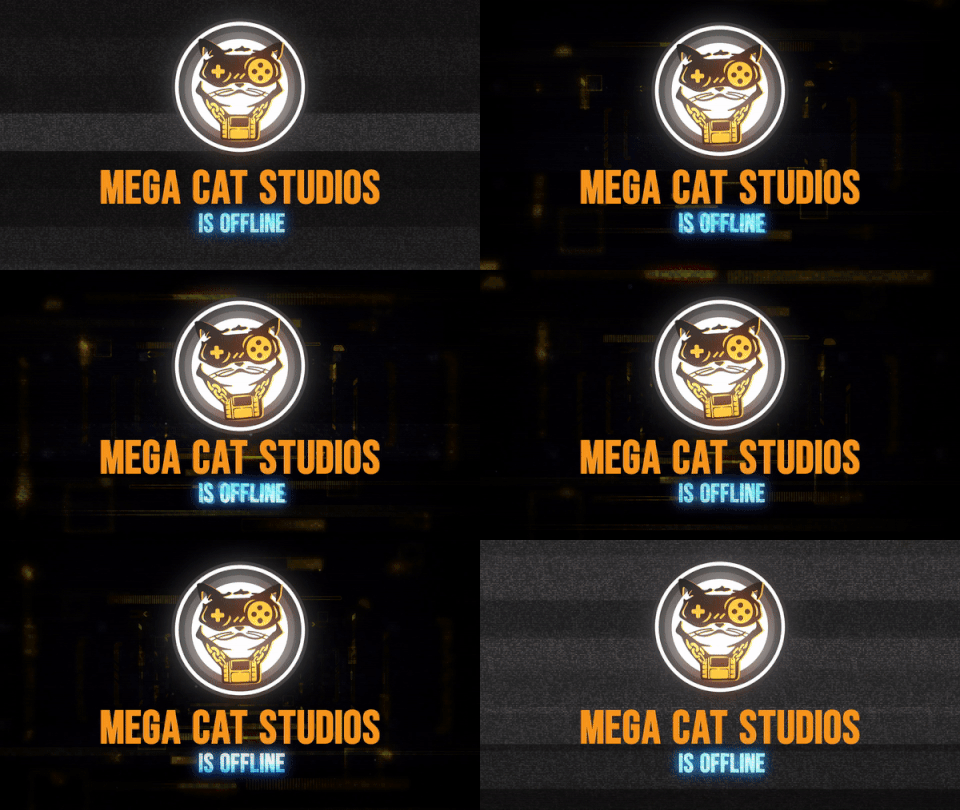


      Marathon-streams, late-night IRL chats, and G-FUEL 's unhealthy numbers ... who needs to sleep when you're having such fun? Yet for R&R, even the streaming gods need time off-camera. The question is, what happens when you're away from your channel? Okay, this is where banners offline come in. When viewers visit your channel, a static banner image featuring (hopefully) engaging visuals will welcome them and some of the channel info essentials. A well-designed Twitch Offline Banner hustles while you're asleep.

      The Twitch Offline Banner is comparatively straightforward when it comes to scaling. Stick to a 16:9 ratio, with suggested 1920 x 1080 dimensions for maximum resolution and efficiency. Do you want to keep it below 10 MB? Then stick to JPEGs & PNGs. Here's pretty cut-and-dry, people.

      So while we're at it, above there applies to your usual stream displays, too. You know, Start Screens, BRB Screens, Stream Stopping Screens, and so on. Just stick with the resolution & sizes above / below and you're good to go, playa.

      Recommended Size: 1920 x 1080 pixels

      Maximum File Size: 10MB

      Accepted File Types: JPEG & PNG


      TWITCH THUMBNAIL


      Often it all hits right on the line ... You 're in the field, the donations and subs are flowing, and talk is in heat. Save the bad boy out as a VOD to reshare with your community at a later date once the Stream Ending screen has rolled on. But a pro streamer knows that VODs alone do not guarantee views – to get followers to press, you'll want to upload an entertaining and innovative Thumbnail image.

      This one is pretty easy – to pull off an awesome Twitch thumbnail you don't need crazy graphic skills. You'll want to stick to the standard 16:9 aspect ratio, with an overall 1280 x 720 pixel dimensions. As simple as pie, stick with JPEGs or PNGs.

      Recommended Size: 1280 x 720 pixels

      Accepted File Types: JPEG & PNG


      TWITCH WEBCAM (OVERLAYS)


      So, you have opted to use an on-stream Webcam overlay. Cheers to that one. Soon, hundreds, if not thousands, of audiences all over the world will see that gorgeous smile of yours. Just don't look like a novice with a slipshod overlay – put some time & thought into your webcam concept and you'll be rewarded with it.

      There are two common Webcam choices to consider here: aspect ratios 16:9 or 4:3. In the end, the decision will depend on the resolution of your stream camera. While 16:9 seems to be more common, some streamers prefer Webcam frames of 4:3.

      Webcams are really a bit of an unusual ity from a production point of view. Pinning down precise sizes or proportions is difficult since streamers usually crop their Camera boxes over OBS to suit the image they 're looking for – or through rendering unique forms by masks, etc. Nearly always, the final frame will be scaled down and modified by each streamer to match their needs. Typically speaking, no two streamers can scale their cam the same wayit all comes down to personal choice.

      For such reason, it is difficult to prescribe a particular webcam size, while we consider making it as wide as possible. Start at the very least with 1920 x 1080 pixels, so that you maintain the consistency of the display when scaling down. Using a PNG (JPEGs are not recommended because they do not enable transparency) if your camera is static. Start with a GIF, for animated frames.

      Recommended Size: 1920 x 1080 pixels

      Accepted File Types: PNG (Static) & GIF (Animated)


      TWITCH PANELS


      Let's talk about your stream info ... If you've ever used the native header markdown on Twitch, you know it's a lot of BLEH. Heyyyy, groups of text, adios viewers. Really, do not get us sick. Veteran streamers use Panels to create sparkling, interactive channel profiles – without eye-soring. Present your most important channel information in meaningful, bite-sized bits while incorporating your stream brand and personality at the same time through unique designs.

      Okay, down to business – let 's talk about sizes. For Panel Headers, the maximum width is 320 pixels – something wider than that and Twitch will scale the image automatically. For height, creativity has a bit more leeway to you. Many streamers enjoy using shorter, horizontal panels with a simple segment title – 'ABOUT ME' or 'DONATE' or 'SOCIAL MEDIA' for example. For these, we suggest 75 pixels (or 320 x 75 px) in height. Others prefer taller, vertical (or square) panels allowing more text and image in the space, in which case we recommend a maximum height of 600 pixels (or 320 x 600 px). The streamers often like to mix in both types. It's your choice. Here, the maximum file size is 2.9 MB while we recommend that you stick to JPEG or PNG.

      Recommended Size: 320 x 75 pixels (Minimum), 320 x 600 pixels (Maximum)

      Maximum File Size: 2.9MB

      Accepted File Types: JPEG & PNG


      TWITCH ALERTS


      Let's be honest, we all want to be noticed by senpai – and that includes your viewers. Only think about some of the game 's largest streamers ... $10 promises you can remember their famous drops of alerts within seconds.

      Stream alerts can be one of the best resources for increasing the Twitch community and encouraging engagement with viewers. Set up your alerts properly, and each supporter, sub, host, or donation can expand your brand of streamer – and bring you one step closer to the pros.

      Unlike the other Twitch graphics listed here, Stream Alerts are generally managed via a third party streamer software, such as Streamlabs, and then connected to your OBS Studio. We suggest that you stick with the 750 x 250 pixel alert dimensions. Go for PNG files for static alerts (JPEGs aren't suitable, since they lack transparency). You'll want to use GIF or WEBM files for the animated alerts. The maximum file size here is 10MB.

      Recommended Size: 750 x 250 pixels

      Maximum File Size: 10MB

      Accepted File Types: PNG (Static) & GIF / WEBM (Animated)


      Welp, this is the end of the guide, folks. Style guidelines and size specifications for all Twitch graphics. Now go ahead and rule the world of streaming like any faceroll-EZ, uber-tilted Bob Ross. The pen is in your hands and the streamer-sphere is your canvas.

      Bite the Bullet Camera

      Bite the Bullet Camera

      The blue line tracks the target interpolation point.

      The single green line represents the position the camera should have after all interpolation calculations.

      The red line represents the past interpolation points (in other words, positions where the green line was).

      You can see how the camera is usually in the same position as the green line (indicated with the camera icon). This is when the camera tracking was working as expected. This was used while I was trying to figure out why the camera was jolting rapidly in certain directions. I wasn't sure if it was the interpolation calculation breaking, or something else breaking it.

      You can observe the target blue line suddenly jumps to a distant location, and at the same moment, the camera goes to its position. This itself visually represents the bug, as the camera should've kept at the same position as the green line, which kept moving smoothly even when the blue line had a big sudden shift in position.

      This showed me that something was overriding the valid calculated position (green), immediately snapping the camera to the target position (blue). In this case, the old code was forcing the camera to fit within our area bounds. Our intended effect was that the target (blue) point would jump suddenly so it stayed within bounds as seen in the video, but not force the camera with it at the same time, instead, allowing it to smoothly track to the target point


      3:23

      How I smoothed camera feel even further, illustrated with shrew diagram:

      C = Camera

      P = Player

      LG1 = Last frame's calculated camera goal position

      LG2 = Current frame's calculated camera goal position


      The calculated camera goal position is based upon things like camera bounds, player position, and aiming direction.

      Your typical basic interpolation would, on the previous frame, have lerped (linearly interpolated) to LG1, and on this frame, lerped to LG2.

      We now also calculate an interpolated goal position (positions of which exist on the red line, in the direction of LG1 to LG2), and the camera interpolates to that interpolated position instead (this new path of the camera path represented by the green line).

      The difference between our method and the basic lerp can be seen by comparing the color-coded paths of the camera. Consider on frame 1 we are on LG1, and on frame 2 we need to go to LG2. The gap between the two purple lines indicates the difference between the camera trajectory when using a basic lerp method. In our method, the difference in camera trajectory is between the purple line to LG1 and the green line leading to the inner-interpolated position.

      This difference is mainly felt in the case of sudden large shifts in goal position. These shifts in goal position will feel smoother compared to a basic lerp method. Imagine for example if LG1 and LG2 were on opposite sides of the camera. In a case like this where the target position made a large sudden movement, with a basic interpolation approach, the camera would turn on a dime to go to its new dramatically different destination. The camera's trajectory would therefore suddenly be in a completely different direction even though its movement is interpolated. Our technique is about also smoothing the trajectory, not just the movement.

      In our method, the change in destination would not have such a dramatic and immediate effect on camera trajectory because the destination we actually use (in the red line above) is the product of interpolation, so the camera will have a soft turn to the new destination. In extreme cases, the direction of the camera's trajectory can still change quickly, but because the destination is interpolated, the camera will 'turn around' slower. The camera isn't immediately interpolating to the distant target point (which would result in high speed), it instead targets the interpolated destination, resulting in a gradual ramp in speed as the interpolated destination tends toward the real destination.


      Lerping Old:


      Camera Improvements:


      Camera 3:


      A Guide to Cinemachine

      A Guide to Cinemachine
      Cinemachine is a suite of camera tools for Unity, which gives triple-A game quality controls for every camera in your project. The easy to install plugin allows you to add functionality to cameras you've already have, or make new ones with varying behaviors. 

      Weiterlesen

      Making An Authentic Metal Soundtrack: Coffee Crisis Case Study

      Making An Authentic Metal Soundtrack: Coffee Crisis Case Study

      How do you achieve such an authentic sound?


      I have compiled a variety of tools over the years that are involved. A couple to highlight in this particular soundtrack would be Superior Drummer 2.0 by Toontrack, a virtual drum kit that draws its samples from a massive library of raw audio drum samples recorded in professional studios, as well as a fantastic amp simulator made by Peavey call Revalver IV. Revalver IV provides a wide array of amplifiers, cabinets, microphones, as well as effects, to select from to provide complete tone control at the tip of your finger. Many of these tools, combined with modern production techniques can produce rather astounding results

      .

      Here we see Superior Drummer 2.0 with the microphone channels routed out into separate tracks within Cubase 5.


      The arrows here point out bus channels that control the output of groups of different channels. For example, the first arrow is the master fader for all the mic channels for the kick drum. There are two kick microphones routed to this fader in this example.


      Here we see the Virtual Mix Rack by Slate Digital as a plugin inserted on the kick master channel.


      This is Revalver IV by Peavey. This is one instance that is active on the Left Guitar channel in Cubase 5.

      A quick look at some of the amplifier models available in Peavey's Revalver IV.

      Tell me more about your creative process for composing music in a game.


      The first question asked is always about the type of experience we are trying to create for the consumer. Next is developing an actionable plan, understanding the tools at our disposal, and to begin laying the foundation of ideas, melodies, and structure in the case of a soundtrack. When it comes to Coffee Crisis, the idea to use abnormal and rapidly shifting sounds throughout really lays well with the concept of the alien invasion. Keeping the idea of the experience you desire to create for the consumer will always help you decide if the content you're creating is content you should use.


      What software tools do you use for composition?


      An itemized list of the products I use are as listed:


      - Superior Drummer 2.0 by Toontrack

      - Omnisphere and Trilogy by Spectrasonics

      - Plugins by Waves

      - Plugins by FabFilter

      - Plugins by Slate Digital

      - Peavey Revalver VI

      Here we see two plugins I often use by Fab Filter. On the left is the Pro - Q. On the right, the Pro - L.


      Here are two plugins by Slate Digital that I frequently use on my master fader. On top is the Virtual Tape Machines plugin and below is the Virtual Bus Compressor model FG - Grey.


      Walk me through the other tools in your production process.


      One tool to talk about would be automation. Every modern Digital Audio Workstation otherwise referred to as a DAW, has some form of automation to use. What this allows for is change over time within the project you are creating. Change over time is an essential component of an effective production whether or not it is music, a film, a book, a game, etc.


      What do you think brings a video game soundtrack to the next level?


      The secret to a successful soundtrack is the ability to have a distinct identity without detracting from the experience itself. Finding the balance between blandness and overbearing can take time, but is always worth the effort.


      How do you balance a soundtrack & sound design when composing music for a game?


      Similar to an earlier response, it is all about focusing on the kind of experience you are trying to create. I would also add that it's never a bad idea to get outside opinions as well during the process. It always has the opportunity to reveal things about the soundtrack when you get a fresh pair of ears involved.


      How do you know Mitch Foster?


      Mitch and I first met in high school as a result of our mutual interest in playing guitar. Consequently, a band was formed that continued for many years. The soundtrack for Coffee Crisis is primarily re-imagined versions of a variety of songs that we had initially composed in the years following high school, a fun fact that few know.


      How can we contact Fist First Records for more information?


      Anyone can contact Fist First Records as follows:


      Email: fistfirstrecords@gmail.com


      Facebook: www.facebook.com/fistfirstrecords/

      Juicier Teleporters & Filmic Color Space

      Juicier Teleporters & Filmic Color Space

      Classic 2D pixel art is timeless, but modern games take the flourishes of dynamic lighting, shades, particle systems, and post-processing effects like a chromatic aberration in bloom. During the creation of Bite the Bullet, some of our senior developers had an immersive round table on how they achieved the layered lighting effect for teleporters used in-game.

      I have to say that seeing them in action brings the process to a whole new level. For demonstration's sake, we’ll keep the reference images as single still capture, and share them as a single gif animation of one of my favorite teleporters to kick off.

      Let’s examine the problem with the teleporter example below:
      With the glow emanating from the center:
      Exhibit A: Linear Teleportation

      In this example, the glow stems from an emissive material, with a ton of effervescence cranked upon it. It looks “ just okay,” but does provide a sweet sci-fi sense of luminescence that any neo-futuristic teleporter would have.


      Yet, there is a way to make it look better.

      Exhibit B: Filmic Teleportation


      The difference is that in the former image, highly saturated color caps out as a solid cyan color. In the latter, it starts turning white, how light naturally behaves in intensity. The former's restriction is fundamentally depending on how Unity's rendering pipeline handles color by default. Our focus here is about the 'color space' rendering output.


      Introducing: Filmic Color Space


      Filmic color space accurately represents the behavior of 'lightness.' If you use Blender 2.79 or later, you may be familiar with this as the default color space starting at that version is Filmic. In Unity, you can achieve the same look by using a tone mapper in the post-processing stack.


      Filmic Blender was created by Troy Sobotka, an industry professional and camera enthusiast who saw the problem with the default color space in Blender and wanted to fix it. So he coded Filmic Blender - a similar color management configuration to ACES, which is the industry standard for VFX.


      Please note, this affects the color of everything. For example, comparing the floor colors in the above two images, you’ll notice that one is slightly darker. With this adjustment to a new tone mapper, the effect on all colors is substantial. If you want your art to translate the game view to look as it was drawn, this requires making this adjustment early in the asset creation process, so all colors are selected and applied as planned.


      In our game, all of the VFX have been made in the previous linear color space, To achieve filmic-looking effects, we added bright white layering, and the contrast between colors was chosen in the context of the linear color space. When viewed in filmic, they'd look extremely overblown.


      Similarly, much of the environment would look too dark because it was made under the assumption it would be viewed under a linear color space - the same color space the artists used when producing the art. In the same way, if you were composing a scene in Blender using linear color space and changed it to filmic color space, you would have to redo all of your lightings to accommodate this. You could choose not to change anything to match. Still, the overall look you get would be very different than you possibly intended.


      The Bottom Line


      Filmic color space will accurately and dynamically represent light behavior in a way that looks like HDR, but the removal of linear color space means that the color you see for a PNG asset in Windows Photo Viewer is not what you get in-game. Filmic color space is more realistic due to its higher dynamic range and translates to a more cinematic look. Even if viewed on a non-HDR display, the effect is still conveyed.

      If you compare linear to filmic, linear usually feels washed out in comparison. But it's not as simple as contrast or saturation. As you see with the light example above; the behavior of color itself changes, especially as you get into extremely bright and saturated colors.

      Effective lighting can give a simple and unfinished space a sense of life and ambiance. Using light, you can provide a level of polish that elevates the entire scene in pixel art games; giving it a modern feel without losing the purity and details.

      Lighting doesn’t necessarily mean using light source objects in your engine. We prefer to use options like overlays and shaders to achieve a dynamically lit look despite not having dynamic light sources present. One of the most interesting takeaways we had during our filmic roundtable; was that for us: a better understanding and command over lighting may be the best way to provide the most effective visual feedback to a player with everything else already standardized. This is likely one of the reasons why people think UE4 looks better than Unity by default: UE4 uses filmic, and Unity uses linear color space by default, aka sRGB.


      Your Filmic Workflow


      Applying Filmic color space effectively in your Unity project requires an adjustment to your workflow, and some planning for visuals on both the artist and development side, planning around a specific color space.


      There is a particular workflow for creating art assets for use in a filmic color space context, such that what the artist sees on their canvas is what you get in the game, 1 to 1. If Unity's filmic tone mapper is accurate, then using a filmic LUT profile in an image editor that supports it would be able to achieve that. For example, the graphics editor Krita has a LUT management system through something called OpenColorIO, which takes an OCIO profile to determine your viewing colorspace.


      Take this Film Emulsion-Like Camera too for Blender so awesomely shared by Sobotka on GitHub:


      https://github.com/sobotka/filmic-blender/blob/master/config.ocio


      Once configured, you will then be viewing your canvas in the filmic color space, so what you see is what you get in-game.


      The cost/drawback being all involved artists would need to have a workflow set up in a way that's compatible with the using a different color space. E.g, if their editor of choice doesn't support it, that's a problem. You can simply choose to have all art made in standard linear color space, but none of it will look exactly as-drawn when rendered within the filmic color space.


      Here's a tip when making VFX, assuming you are staying in linear/sRGB color space:


      Make the first iteration in linear color space, switch to filmic, and take a snapshot of it. Switch back to linear and try to recreate the filmic look using layering and adjusting colors. You can never 100% recreate it, but you can get close in the 50-70% range.


      As an example below:

      Exhibit C: Our teleporter in linear

      Then, after:

      Exhibit D: Faux-Filmic


      Filmic for reference:

      Exhibit E: True Filmic


      It’s close! It took a second iteration, around twice as much time in total, but it gets strikingly closet to our desired effect. You have to use a whole other layer of problem-solving and creative decisions to get to the same point that filmic gets by default, and that's only if you're faking lighting like we are with our emissive materials. Additionally, if you animate or tween VFX (which is often the case with our projects), you’ll have more layers than normal to animate, and there will be a performance hit of more VFX-related objects rendering. If you are using actual real-time lighting, your mileage may vary in achieving a filmic color space look and feel while remaining in linear color space.


      Our 2d projects pretty much never use real-time lighting for performance reasons. There are some cost considerations to achieve this level of juicy lighting, but for many, it’s a toll happily paid.


      If you have a lot of dev-side VFX, especially with high complexity like particle systems, adding the art cost of using filmic would be worth it. Otherwise, if flashy VFX are rare and/or simple, it would probably be better to just fake filmic look on dev side with tricks. The main time cost in our consideration above is on the art workflow and existing assets that were already created in a different color space.


      Adjusting your art toolchain the first time, and then getting familiar with the adjusted workflow can take some time in and of itself. Most artists have a personal preference of one or two programs (Photoshop, GIMP, Aesprite, GrafX2, GraphicsGale, etc), but will adopt a specialist set of brushes, or programs for a given project due to a unique feature. For example, some of our pixel artists prefer animation of pixel art to be done in Aseprite simply because of features like onion-skinning (not to mention the simplicity of importing sprite sheets into Unity using .ase files).