FREE US SHIPPING ON ORDERS $175+

Translation missing: ko.general.language.dropdown_label

Translation missing: ko.general.currency.dropdown_label

0 Cart
Added to Cart
    You have items in your cart
    You have 1 item in your cart
      Total

      Retro Development — super nintendo pixel art

      SNES Sprite Engine Design Guidelines

      SNES Sprite Engine Design Guidelines
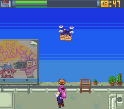
      SNES sprite limitations are much more forgiving than NES limits but there are still design considerations when it comes to producing high-quality games. This guide will explain the technical aspects of creating sprites for the Super Nintendo and highlight some important terms for developers and artists.

      Read more

      Super Nintendo Graphics - Read in the voice of Brendan

      Super Nintendo Graphics - Read in the voice of Brendan

      Hello again, ya’ll! It’s me. Your ol’ pal Brendan back to talk about some GRAPHICS. When I first walked into this subject, I thought it was much simpler than it turned out to be. I was once like you. Stupid. Ignorant. Talentless. But then, I learned how to do SNES graphics and that ALL CHANGED. True story.

      So where do we even start? Well, think about your favorite SNES game. What do you like most about it? The gameplay is always a good answer, but what comes before that? What you see on the screen. Admit it. If the graphics look bad, you’re likely to move on and find something cooler. Maybe that’s not you? Maybe you’ll play ANYTHING. Well, you still need to see something on the screen when you push buttons. So when you push a button, something changes on screen. Wait. Hold on. I need to interrupt for a second…

      I am AWARE of all the different kinds of games created nowadays that have challenged typical ways of playing video games, but I’m talking about just your typical SNES game. Not like, some game you play with a VR headset where you only hear stuff and look around and like, try not to die or something. But that does sound pretty cool…alright back to what we were talking about…

      So yeah. Push buttons, stuff happens on screen. All of that stuff on screenplays a role and is pieced together with different information contained in the cartridge and in the system. When you start to understand these pieces, you begin to really appreciate SNES games in a new way. They had limitations to work around, just like on the NES. But the SNES was also a very advanced console for its time. In this blog, we are going to break down some of these graphical fundamentals and better understand them. After we understand them, then we can figure out how to properly create graphics for a SNES game.

      Where does color come from?

      The same place it’s stored, silly. It’s called the CGRAM

      CGRAM stands for Color Graphics Ram. This here is the memory that all of the colors are stored in (unless…well, you’ll see). This is going to consist of 256 color entries, and this big chunk of info gets separated into different lines of palettes and color entries with graphics modes that use Indirect Color. Alternatively, you could choose a graphics mode that utilizes Direct Color Mode, which allows you to store the data for every color in bits contained in a pixel instead of keeping that info in CGRAM. Indirect Color uses code that will call up a palette from the color bank in the CGRAM.

      Why have these two ways of coloring each pixel? Couldn’t they just stick WITH ONE?! Way to be indecisive, guys.

      Just kidding. Calm down Super Nin fans. Sheesh.

      Well, the answer is pretty simple. Direct Color Mode = less variety of colors are available. There’s more space taken up on each bit by representing the color itself in Direct Color Mode, so you can’t use as many colors. If you switch to Indirect Color in another mode, there’s more space on each bit to fit more color! This is because it takes less information to simply recall color from a “list” or, palette. Being able to do this makes swapping out palettes easier. This stuff gets kind of complicated but that’s why it’s fun!!


      Bits Per Pixel (BPP)

      This is the information that is stored in each pixel for an image and can vary based on the quality of the image and also what the operating system can display. We are going to focus on the information that determines color depth, which is defined by the bits within the image. Each pixel uses varying amounts of bits to determine the color in the image. The more the bits, the more colorful the image. For example, when you have an image that is 2BPP, only three colors can be represented (3 colors, and 1 transparency “color”). More often than not, when creating SNES graphics, you will be creating assets that use 4BPP, which allows you 15 colors and one transparency “color”. The amount of bits per pixel is determined by the graphics mode that you will be using in your game. However, all objects on the screen (this refers to sprites) will be 4BPP. Another thing to note is that you can use multiple graphics modes in one game.

      Here is a simple chart (fig. 1) that shows how much color can be used for each background in each graphics mode:


      fig. 1


      That being said, let’s talk about the graphics modes.

      Graphics Modes

      The SNES operates with several graphics modes. Eight to be exact. Each one basically showcases a different capability of the SNES. I’m sure you’ve seen games like this (fig. 2)


      fig. 2


      That’s a pretty famous one. Now here you can see the basic set up of a standard Super Nin platformer. During this gameplay, the game will be in one mode, while here (fig. 3) you’ll see another game operating in a different graphics mode.

      fig. 3

      As you can see, the SNES was pretty powerful for its’ time. Each of these modes gives you different restrictions on color depth, as shown in the chart above (fig. 1). Determining what mode you’ll want your game to be in will depend on the type of game you’re creating and how you want to tell your story. We have an excellent and in-depth guide to SNES graphics written by my colleague about SNES development from scratch…in fact that’s what its called… You can find that here!

      SO, what are some of the aspects of each mode that would help someone decide which mode to use? Allow me to explain it a bit :) Please read this list. Thank you.

      Mode 0: So here we have a mode where you can use 4 backgrounds (also known as graphics planes), with a color depth of 2bpp. This uses the first 32 color entries, which will be the first 2 palette lines. This is the same for all of the backgrounds. Here you’ll see this demonstrated with fig. 4:

      fig. 4

      This mode was neat, but not used very often because of the color limitations. When you’re creating this stuff you want to use as many colors creatively as you can as they can go a long way graphically. From the CGRAM (Color Graphics RAM, or, the memory that handles color) Tile sizes allow for 8x8 or 16x16 pixels.

      Mode 1: This was a very popular mode to use as it would allow you 2 backgrounds with 4-bit color (16 colors, 4BPP), as well as a third background that is 2-bit color, which is great for UI (user interface) or other simple effects like explosions, bullets, and other embellishments. Here you can see how the palettes are distributed for use in fig. 5:

      fig. 5

      Alternatively, the palettes and colors can be pulled from in a slightly different way, which will also be determined by the programmer (fig. 6):

      fig. 6


      Mode 2: This mode is very similar to mode 1, but here instead of having a third background the data that would normally be used for a tilemap is instead used as scroll data. This would be used well in a game that uses a lot of columns, like a puzzle game. Tile sizes allow for 8x8 or 16x16 pixels. Here, the palette would be set up like so (fig. 7):

      BG 1

      BG 2

      fig. 7

      Mode 3: Here we only have 2 backgrounds but background 1 has a color depth of 8bpp or 256 colors and background 2 utilizes 4bpp, 15 colors, and one transparent “color”. Background 2 shares colors with background 1. Background 1 is also able to use Direct Color Mode. Tile sizes allow for 8x8 or 16x16 pixels. Again you can see how the palettes are set up in the CGRAM and pulled from (fig. 8) and then how Direct Color is set up (fig. 9):

      fig. 8


      fig. 9


      fig. 10


      Mode 4: Similar to mode 3 in that there are 2 backgrounds, with background 1 again having a color depth of 8bpp and background 2 having a color depth of only 2bpp, 4 colors. It's limited to scrolling either horizontally or vertically only. Fig. 10 shows how the colors are set up in CGRAM, and again how the colors are set up in Direct Color Mode (fig. 11):

      fig. 11


      Mode 5: This mode only supports two backgrounds. Background 1 uses 4 bpp, while background 2 uses 2 bpp. Pretty limited. The reason for this however is because this mode also supports true horizontal 512 modes. What this means is that now the horizontal measurement of the resolution for the graphics will double from 256 to 512 pixels. This will make things look squished on the screen. The character size in this mode goes from 8x8 pixels to 16x8 pixels, and the other supported tile size remains the same at 16x16 pixels.

      Mode 6: This mode is bananas because its’ a combination between modes 4 and 5, in that it supports offset change per column AND true horizontal 512 mode but the trade-off here is that it will only support 1 background at 4bpp. Lots of give and take here and that’s a big take away from explaining these modes. and now…

      MODE 7

      Yeah, this one is badass. Hence the red color.

      This one is pretty nuts. For starters, it uses its’ own “special format”. It won’t display graphics the same way as the previous modes. The tilemap and the graphics perform in an alternating fashion via the VRAM. Each character is 8x8 characters, which isn’t too different, however, a total of 256 characters are stored in VRAM in total. The tilemap is going to me 1024X1024 pixels, or, 128x128 characters (8x8 pixels). These can alternate because it allows the tilemap and graphics to both occupy their own chip which allows for streamlining graphics.

      In this mode, you will also be able to manipulate the objects on the screen in very different ways from previous modes. You can zoom in and out quickly, squash and stretch the sizes of the objects, rotate them 360 degrees, reflect them and skew them with no real problem. Ok, wait. Like, seriously? Yeah, bro. Seeeeeeeriously. And when you combine the parameters that govern these effects you can start to do some really cool stuff.

      Examples of the use of these effects include Mario Kart, Star Fox, and F-Zero most famously (fig. 12):

      fig. 12

      So, wow. The Super Nintendo was and still is an amazing machine. It changed the world and it changed video games forever. Now, I assume, you have a pretty good idea of why and how it did too. There are of course many other technical aspects about this system to go over, but we’re going to wrap it up here because we want an understanding of how this stuff works so that we can create graphics for SNES games.

      There are just a couple more things I want to talk about before we wrap things up here. The first of which is again how important it is to keep in constant contact with the programmers so that you can both be on the same page as far as what is needed and also what is possible for the game that you are working on. After reading this it should be a little easier to communicate with them and already have an idea of what you as the artist need to do.

      Another thing is that you need to keep the palettes in mind. You want to create sets of colors that are going to go a long way and serve many purposes seeing as you will have limitations. For instance, if you have a character that is like, mostly green with some white embellishments or something you could throw in bright orange and/or pinkish-red for glowing effects. Then maybe you could use that again later for something else, etc.

      Finally, you’ll want to get in the habit of creating sprite sheets as soon as you’re done with animation. There are several methods to do this, but the first thing to keep in mind is that you’ll want to first off create the animation with the dimensions of the sprite or object like it always has the same same size square around it. This is because you can only have two sizes of sprites on the screen at one time. So for example, you could make your characters inside a 32x32 pixel square, and the ammo they shoot would fit into 16x16 pixel squares. You don’t have to fill every pixel of the square, of course, just keep stuff within those dimensions. You can then use these dimensions as a guide for when you create the sprite sheets. Here, lemme show you in fig. 13:

      fig. 13


      Each one of the frames here has an invisible square around it that is 32x32 pixels and each of those squares is right next to each other without any spacing. And this my friends, is how you make a sprite sheet!

      So to wrap things up, have fun, and stay creative! I’ve had a lot of fun working on this stuff and learning about it. This entry was a glimpse into my learning experience and I hope that it helps you too.