Indexed Colors for Retro Backgrounds

Hello everyone, it’s Brendan again. Today I will be talking about a neat little trick I came up with to speed up working in limitations or with a particular palette that you just plain LOVE. This trick is useful for creating retro background graphics. Basically, we’re going to create an image quickly, and then even more quickly-er we will color it! It’s great, it really is.
I’m going to be creating an image that’s going to fit into the limitations set by the Sega Genesis system. I say limitations, but Sega was a powerful, proud system that had an excellent career and really gave Nintendo a run for their money. My childhood was steeped in a conflict between the Sega kids and the Nintendo kids. Lots of blood.
Alright, so our first step is easy and sloppy. Yup. What you’re going to do here is something that you might be comfortable with as it’s just sketching. In this instance, the bg (background) I’m working on will need cobblestone and I thought to do them in an arching pattern across the bottom of the screen. The scene takes place in a Mexico-like neighborhood with some older architecture.

So here you can see that I began sketching the cobblestones out pretty quickly. This is a cleaned-up version, and also I took the time to duplicate the original arching pattern layer and move it to the left and the right to make sure the pattern continues seamlessly so that when you set them next to each other you can’t tell its a repeating pattern (pretty standard stuff).
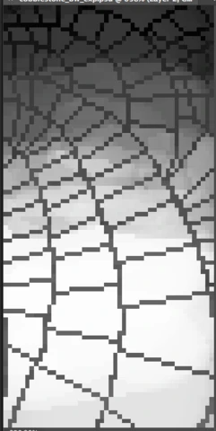
So to start, I drew the pattern out in grey over a black background like this:

I chose to do it this way because I want the lines to be a middle of the ground kind of color, like a warm or cool color with a little less saturation. The stone part is black because, for me and my own process, I’d like to add the brightest white on the bottom of the image, and then add less and less towards the top to create some depth.

Tada! So I’ve been working with one layer, and to color around the lines I used the Color Range (Select->Color Range…) tool in Photoshop to select only the color of the lines. You can do the same with the Magic Wand tool, but it takes a little bit more time. I made a custom hotkey to get to that command even quicker. So once the lines are selected, I use cmnd+i to select the inverse of the image so that I’ll only be coloring the black part. Then I grab some white and turn the transfer on my brush and go to town!
While I work my way to the top I sample whatever grey color I create with the transfer from the white so that it creates a gradient. The area I’m coloring is still selected, so at this point, I press cmnd+i again to select the lines and color black in from the top down a little bit at a time.
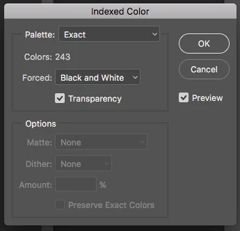
The next step is tricky only in that you have to remember what you have to pick in the menus. So what we’re going to do is go to Image->Mode->Indexed Color, and you’ll get a small window to pop up.

Man. There is a lot of black/white/grey going on in this entry…lemme just make this more interesting to look at.

There. Merry Christmas!
Here you see that you can select a palette at the top, and we’re going to click on in and select Local (Perceptual) and it’s going to immediately change the image to something more…video game-y. When you select that, next to Colors a box will appear around the number. The number may or may not change, but you’re going to click in the box to change that number to 16.
The reason we’re doing 16 is that with a Sega Genesis, we’re going to have 2 15 color palettes with one transparency (making 16) and we’re basically counting that transparency as a sixteenth color in this instance. This has nothing to do with the Transparency checkbox we see on the menu, however. We’re going to go ahead and uncheck that box though.
So, we’re done here for now and you can click OK. The image will now look a little something like this:

So we have some interesting things going on here. The gradient is still there, but you can see that some rough dithering, and some random spots of lighter colored pixels. For now, we’re going to step away from this picture and open up the project I’m working on to create a palette for this image.

This is a little slice of the level I’m working on that contains all of the colors in one of the palettes. Now we’re going to go to Image->Mode->Indexed Color… again. By the way, sorry, I forgot to mention this - when you want to index the colors, it’s going to flatten the image, and you have to be cool with that. I KNOW. You probably want to work with layers but trust me, a lot of stuff that you do in the 8/16bit style is fine to do on one layer.
It took me a while to ease into it too, but now I don’t mind it at all. In fact, a lot of shortcuts I use to make working in one layer faster than several and way less confusing. Anyway, let’s get back to indexing these goshdarn colors, huh?

So the little menu will pop open again, but it’s going to have a much smaller number next to Colors. Here, it says 18. The first thing we’re going to do is click on the box next to Forced, and select None. Again, you’ll want to uncheck the Transparency box. The number is now going to go down to 16. Then we’re going to click on the box next to Palette and this time we’re going to select Custom, and another small window will pop up.

Now that we have our palette, we gotta save it for later use, so duh, click Save. It’s going to save as something called a .act file, which I’m not sure what it is, but I intend to find out later. Anyway, we’re going to go back to our cobblestone image.
Again, we’re going to Index the colors the same way we have been, but this time when the window opens click on the box next to Palette, and select Custom, and you’ll see that ^ window open again, but this time, click on Load, and grab the palette we just made. If you have Preview checked (it is by default all the time) and it will show you a prev…wait, what happened?

OOOOOHHHHH I know what happened here. We had a greyscale image and we wanted to throw a palette on here that also had grey in it. Welp, we can’t have it looking like this. THIS SIMPLY WILL NOT DO. I’m pretty scrappy with my techniques and I make up a lot of stuff on the fly to quickly do stuff, so what I’m thinking I can do is just make another custom palette with more limited colors, picking the ones I want to use instead of the entire palette. Let’s see how that goes.
So I cut out the pieces with the colors I want and made a palette out of that. I took out the grey colors and made a palette of 10 colors instead of 16.

From left to right, we have a few options. The first one I picked the new 10 color palette under Custom… and where it says Dither in the window I selected none. That’s ok, but I want a little more detail maybe.
The middle picture is the same thing but with the Diffusion option selected for Dither. Wow. That got crazy.
OK, so for the last one I picked the original palette, but I used my trick earlier to select all of a certain color in the image (Select->Color Range…) and then changed some of the colors that way and I also tweaked the dithering a bit.
So this trick of course isn’t going to do all the work for you, but it will save a bunch of time with picking colors and doing your own dithering. The rightmost image needs a little more work but it didn’t take much time to get to that point and it won’t take much more time to finish things up! I’m going to go ahead and mention too that this is a pretty big chunk of tiles, so you’ll want to keep that in mind when you’re creating tiles like this with a lot of individual pieces, and you may want to double up on a few and flip them around a bit to really get a lot of mileage out of less.
I hope this trick helps you out as much as it does me! Continue experimenting and finding ways to speed up your workflow and before long you’ll be cranking out assets in no time! Catch ya’ll later.


