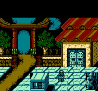
Creating NES Backgrounds and Graphics
Introduces NES palette restrictions and pixel art techniques by creating a background for an NES game.
background Nov 15, 2017
Introduces NES palette restrictions and pixel art techniques by creating a background for an NES game.
background Nov 15, 2017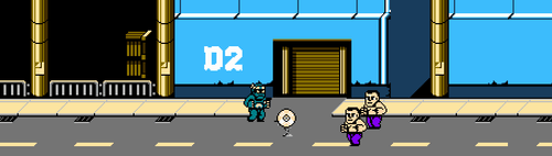
Resolution The NES brought a new era of bringing arcade action into the living room. 22 years later, it still...
90s game Sep 21, 2017
3559 Bigelow Boulevard Pittsburgh, PA 15213

