
Retro Development
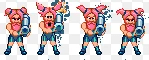
Enemy Design 201 - Lethal Wedding
The second in a series about designing enemy concepts and behavior, using examples from Lethal Wedding.
bride games Jan 12, 2018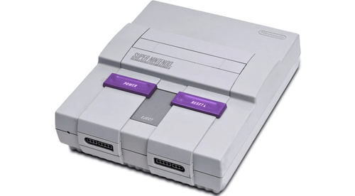
SNES Development - Starting from Scratch
Highlights the pitfalls of SNES development tools
homebrew snes games Jan 03, 2018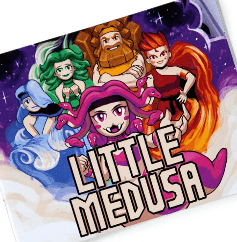
Level Design 101 - Little Medusa
A primer on Level Design using the NES game Little Medusa as an example
designing NES levels Dec 29, 2017
We Got Dungeons - Dev Log 5
Happy Holidays and welcome back to the dev log for our upcoming game We Got Dungeons! Today we'll talk a...
90s game Dec 25, 2017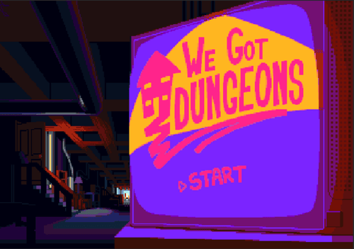
We Got Dungeons - Dev Log 4
Hello everyone and welcome back to the We Got Dungeons dev log! Today we will be talking about path-finding! First...
90s game Dec 19, 2017

